We are a creative studio dedicated to crafting meaningful ideas and pushing boundaries.
By seamlessly blending purposeful strategy with contextual design and art direction,
we create impactful works that resonate and leave a lasting impression.
10
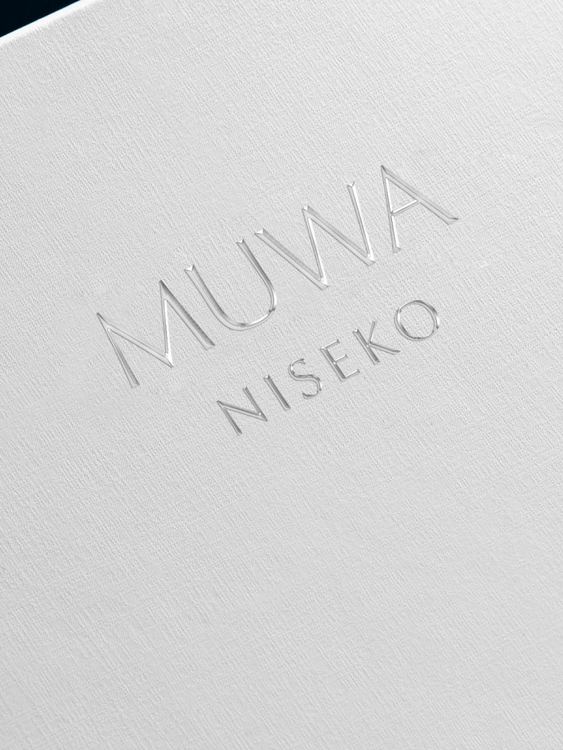
MUWA
StrategyIdentityDigitalMotionTypefaceEditorial
2024
13
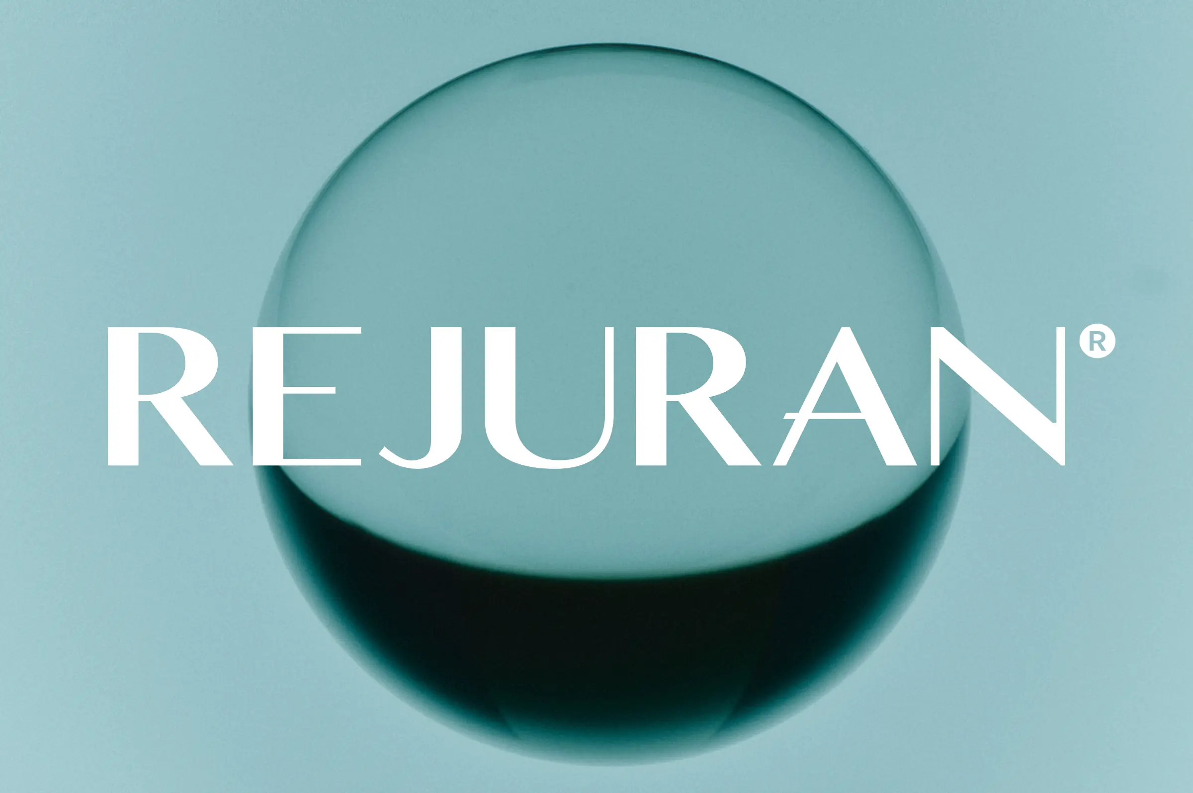
REJURAN
StrategyIdentityArt Direction
2025
12
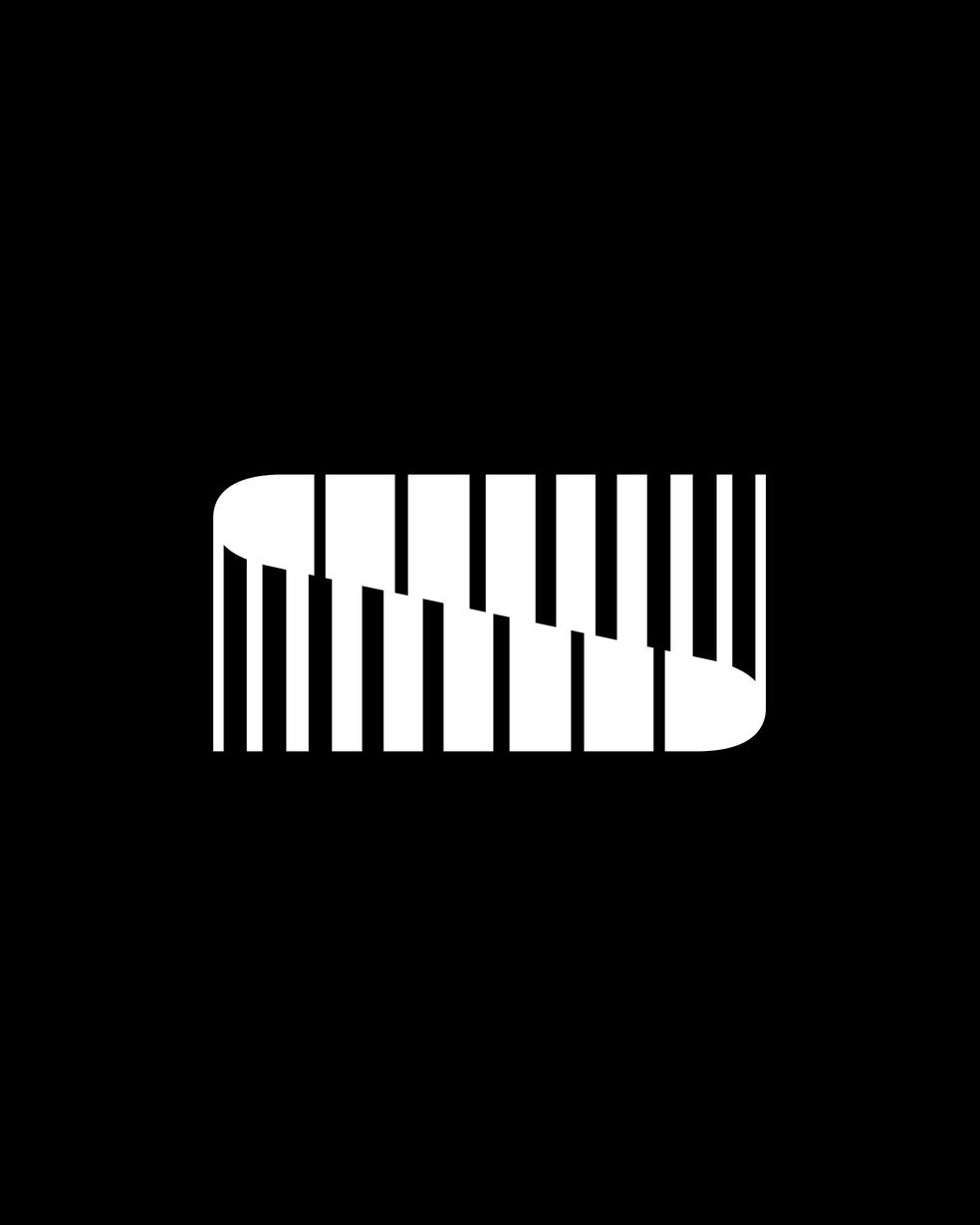
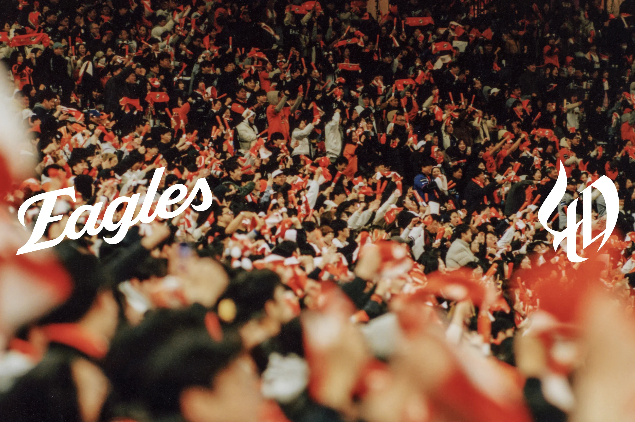
Hanwha Eagles
StrategyIdentityGraphicTypefaceSystemCampaignArt DirectionUX Research
2024
STUDIO UPDATES
NEWS
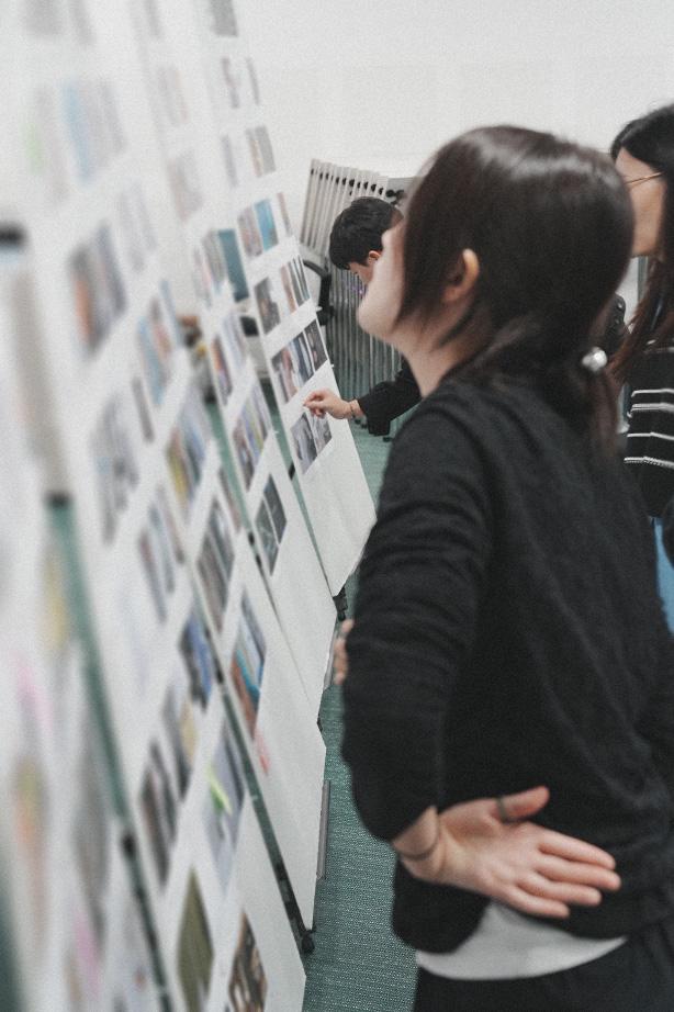
Grid at University of Seoul
We were invited to the University of Seoul to share our evolving framework, Seven Attitudes to Consider—principles we believe hold deep meaning for students studying graphic design.
0.0.1
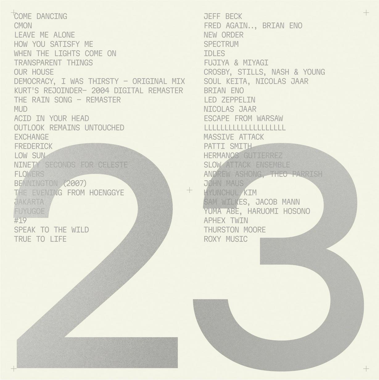
New Grid Playlist
To mark the launch of our new website, we've put together some of our favorite sounds. Hope you enjoy.
Click to listen to the Playlist
14.1.1
New Project : Hanwha Eagles Fan Campaign
Since its foundation in 1985, Hanwha Eagles has been a pillar of Korean professional baseball, going through numerous changes and challenges. In 2025, the team's 40th anniversary year, Grid proposed the “40th Anniversary Fan Campaign,” a tribute to the longtime Hanwha Eagles fans, by going into their daily lives and highlighting the spirit of tenacity and passion that the team and fans share.
NEWS
Grid at Seoul National University
Grid was invited to offer feedback on the portfolios of Seoul National University students. Additionally, we had the opportunity to share our insights on Work Ethics, Work Processes, and Work Environments.
NEWS
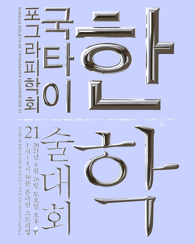
Sang Mun at Korean Society of Typography
Sang Mun presented a talk at the 21st Korean Society of Typography Conference, focusing on his ongoing work in the field of Typeface Design aimed at promoting awareness of personal information protection in the Digital Age. His presentation shed light on the ways in which typefaces can contribute to safeguarding sensitive data. Furthermore, Sang Mun's paper on the same subject was published in the LetterSeed 20, solidifying his contribution to the ongoing discourse on personal information security.
NEWS
Grid Bali Workshop 2022
Grid held a workshop in the island of Bali, Indonesia. The workshop took place from May 7—10, serving as a gathering to foster collaboration and reach a consensus on the company's vision for the future. Bali's serene and vibrant environment provided an ideal setting for the participants to engage in productive discussions and creative brainstorming.

NEWS
Sang Mun at Google Design
Design Notes is a show about creative work and what it teaches us, hosted by Liam Spradlin. In this episode, Liam speaks with interdisciplinary designer Sang Mun. In the interview, recorded in Seoul, South Korea, Liam and Sang explore how the ZXX typeface—which was born from Sang’s experience in special intelligence—helps us consider privacy and the nature of the information that shapes our lives, how accessible tools can empower users, and how to think about the practical constraints we all face as designers.
13.2.14
New Journal : Shaping a New Narrative
This article provides a light overview of the REJURAN brand identity renewal project, outlining the strategic process and unique approaches taken to redefine and elevate the brand’s visual and conceptual framework. It touches on the key phases of the project, showing how the identity was restructured and refined to align with REJURAN’s core essence and global positioning.
GET IN TOUCH
Grid
SEOUL :